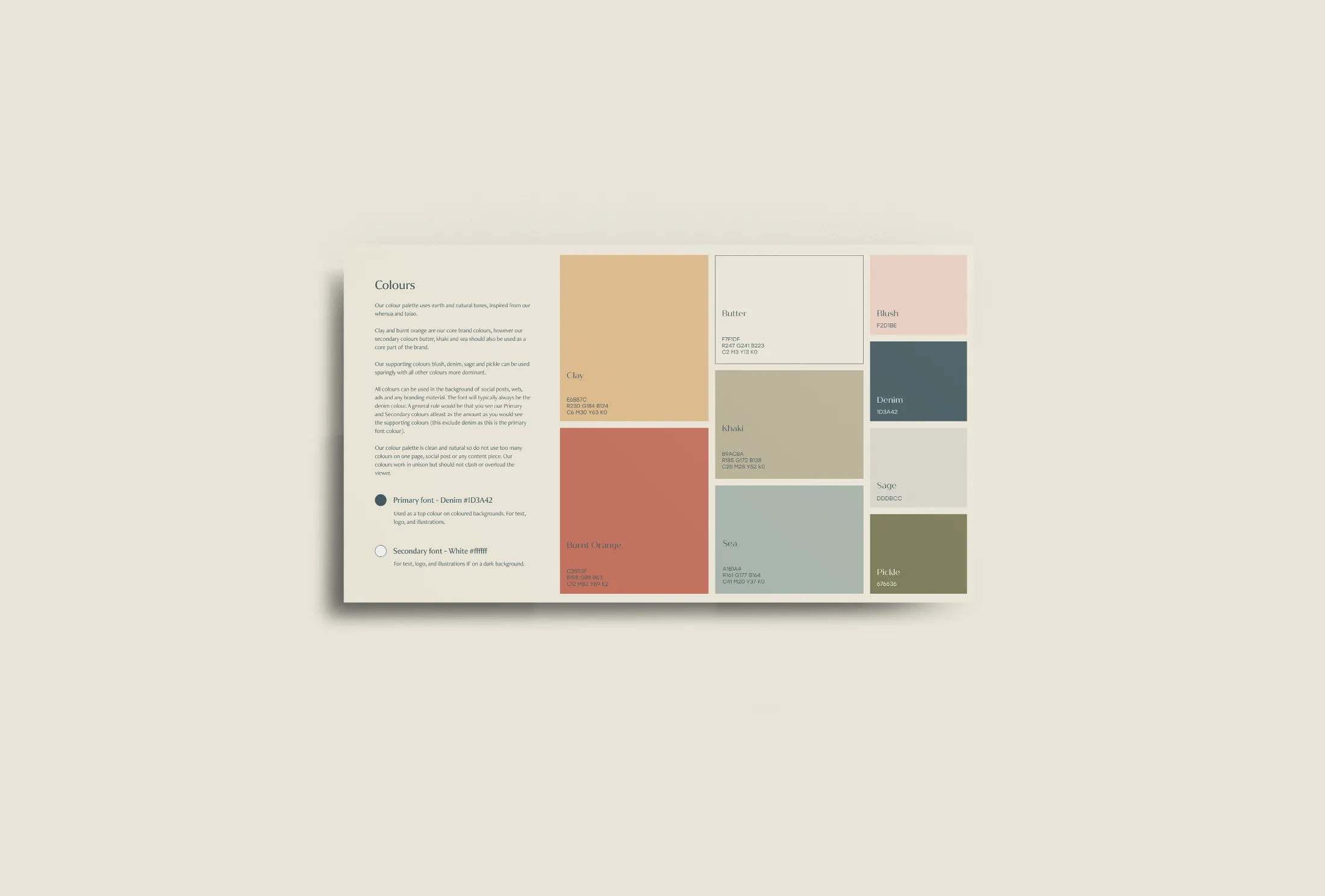
Color is a powerful tool that designers can leverage to evoke emotions, communicate messages, and enhance user experiences. Color psychology, the study of how colors impact human behavior and emotions, plays a crucial role in design. In this article, we will explore the fascinating world of color psychology and provide insights into effectively using colors to create impactful designs.
Different colors have different psychological associations. For example, warm colors like red and orange can evoke feelings of energy, excitement, and passion. They can be attention-grabbing and are often used to create a sense of urgency or stimulate appetite. Cool colors like blue and green, on the other hand, can evoke calmness, tranquility, and trust. They are commonly used in healthcare and financial industries to create a sense of reliability and professionalism.
Understanding the psychological impact of colors can help you effectively communicate your brand’s message. Consider your target audience and the emotions you want to evoke. For example, if you’re designing a website for a luxury brand, using a color palette with rich, deep hues like gold or purple can convey a sense of opulence and exclusivity.
Color combinations also play a significant role in design. Complementary colors, which are opposite each other on the color wheel (e.g., red and green or blue and orange), create a vibrant and visually striking contrast. Analogous colors, which are adjacent to each other on the color wheel (e.g., blue and green or yellow and orange), create a harmonious and cohesive look. Experiment with different color combinations to find the ones that best suit your design objectives.
It’s essential to consider cultural and contextual associations with colors as well. Colors can have different meanings and symbolism in different cultures. For example, while white represents purity and innocence in Western cultures, it is associated with mourning in some Eastern cultures. Always research and be mindful of the cultural context when designing for a global audience.
When using colors in your design, be aware of their impact on readability and accessibility. Ensure there is enough contrast between text and background colors to ensure legibility. Consider color blindness and design with alternative techniques, such as using patterns or texture, to convey information.
In conclusion, color psychology is a powerful tool that designers can use to create impactful designs. By understanding the emotional associations of different colors, considering color combinations, and being mindful of cultural contexts, you can harness the power of colors to communicate messages and create visually engaging experiences.
